How to Create User Friction For Good
Marketers usually use the term "friction" to refer to obstacles that prevent people from converting. Most marketing advice says to reduce friction as much as possible.
But not all friction is bad.
Sometimes friction does the opposite of what you're told. It can actually drive purchases and keep users engaged.
Here's our friction framework:
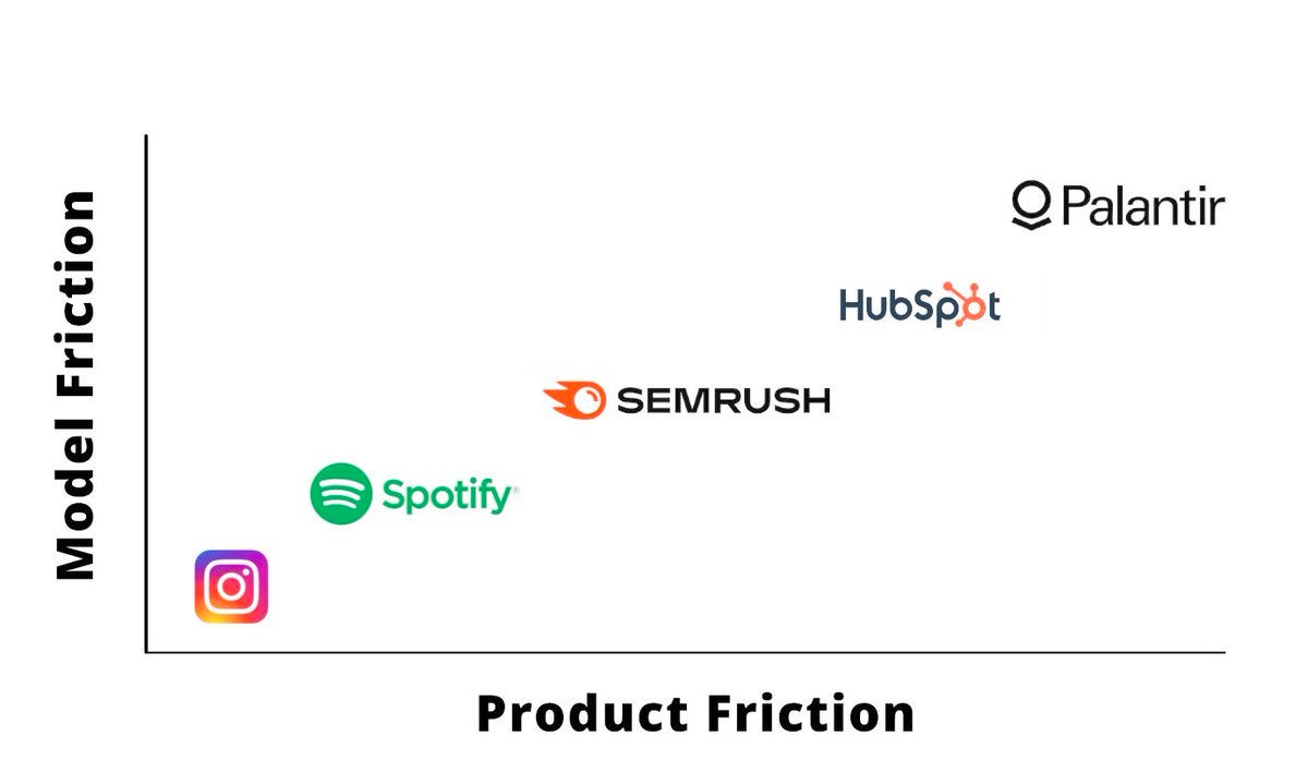
Align your product friction with your business model friction.
Low product friction = easy to sign up for and get started in
Low business model friction = low price, simple pricing structure
The higher one is, the higher the other should be. Some examples:
Instagram: easy to sign up for and free to use
Spotify: easy to start, low subscription fee
Semrush and HubSpot: more complicated pricing matches more complicated products
Palantir: highly complex (and pricy) solutions built for enterprise
Quick list of "good" types of friction:
Personalization (e.g., Canva asking what you'll be using Canva for during onboarding)
Cross-selling / upselling near the checkout
Helpful tooltips or a short product tour
Major announcements, like Headspace's recent popup introducing a UI upgrade (but keep them short)
And bad friction:
Requiring a credit card for signup
Prompting users to get push notifications early on
Requiring account creation to check out

